A word on getting back into gamut.
00:42
A friend of mine asked for a print of the GGB tower:
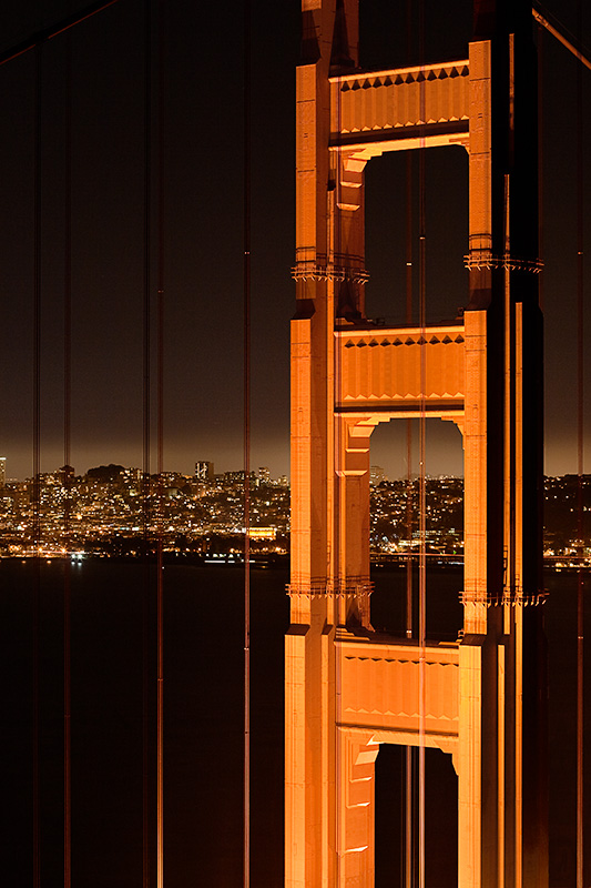
So I've been working on one. One thing I tried when dealing with getting this image into gamut was using Photoshop's select by color range to select out-of-gamut colors. But after making a proof print last night, I found a lot of areas that looked like crap because the selection hadn't been feathered at all, resulting in lots of ugly gnarly edges.
Sharpening's kind of proving to be a hassle, too - ugly artifacts in both some of the fine detail and the smooth tones in this image. Trying to fix that noise is leading to some posterization, too. So, yet more work ahead.
More about the gamut warning.
01:52
So I've been working on smoothing the haze in the sky above the city. The first thing I did was go back to Lightroom for a version of the photo that had not been autotoned - pushing the exposure up and then dragging it back down worsened the banding considerably. But the sky and water were too dark, so I wanted to drop them closer to black. I added another curves adjustment layer, magic-wanded the haze, and applied a gradient to it in the layer mask - and it looks pretty good.
So I went ahead and printed a strip, which is good. Then I toggled the gamut warning and noticed that the curve had taken most of the bridge tower out of gamut. But the printout looked fine, even compared to other prints which I know are in gamut. So what the heck?
Andrew Rodney says that these days the gamut warning is pretty useless, so I will probably not use it anymore.